 Tool
ToolHow the Tool Grading rubric works: four sub-scores, one scoresheet

Every tool on this site carries four numbers between 1 and 5 and one overall grade, which is the plain average of the four. The numbers are only useful if a reader knows what went into them, so this note sets out the rubric in the same order the site applies it: what each sub-score measures, which sources are allowed to feed it, why no first-hand testing is involved and why that is printed on every review rather than left for the reader to infer, and how to read a single score without over-reading it. The methodology page at /method/ holds the checklist itself; this is the working explanation of how the checklist turns into a grade.
Four sub-scores, equal weight
Each product receives four sub-scores: ease, features, value and support. They carry equal weight, and the overall grade is their arithmetic mean rounded to one decimal place. There is no secret fifth factor, no editorial adjustment after the fact and no paid placement that moves a tool up the table. Equal weighting is a deliberate choice rather than a mathematical claim about what matters most. A reader who believes support should count double can rebuild the grade from the four published numbers in a few seconds, which is the point of publishing them separately. A weighted composite would hide that choice inside a formula.
Ease measures how quickly a team of five to fifty can get the tool configured and learned, judged from the vendor's own onboarding documentation, the number of decisions a new workspace forces, and the pattern of complaints in verified user reports. Features measures depth on the tool's core job and the published limits around it, not the length of the feature list. Value is calculated at a realistic team size, usually ten people, against the published pricing structure and against competitors in the same category. Support covers channels by tier, documented response commitments and the quality of the self-service material.
Where the evidence comes from
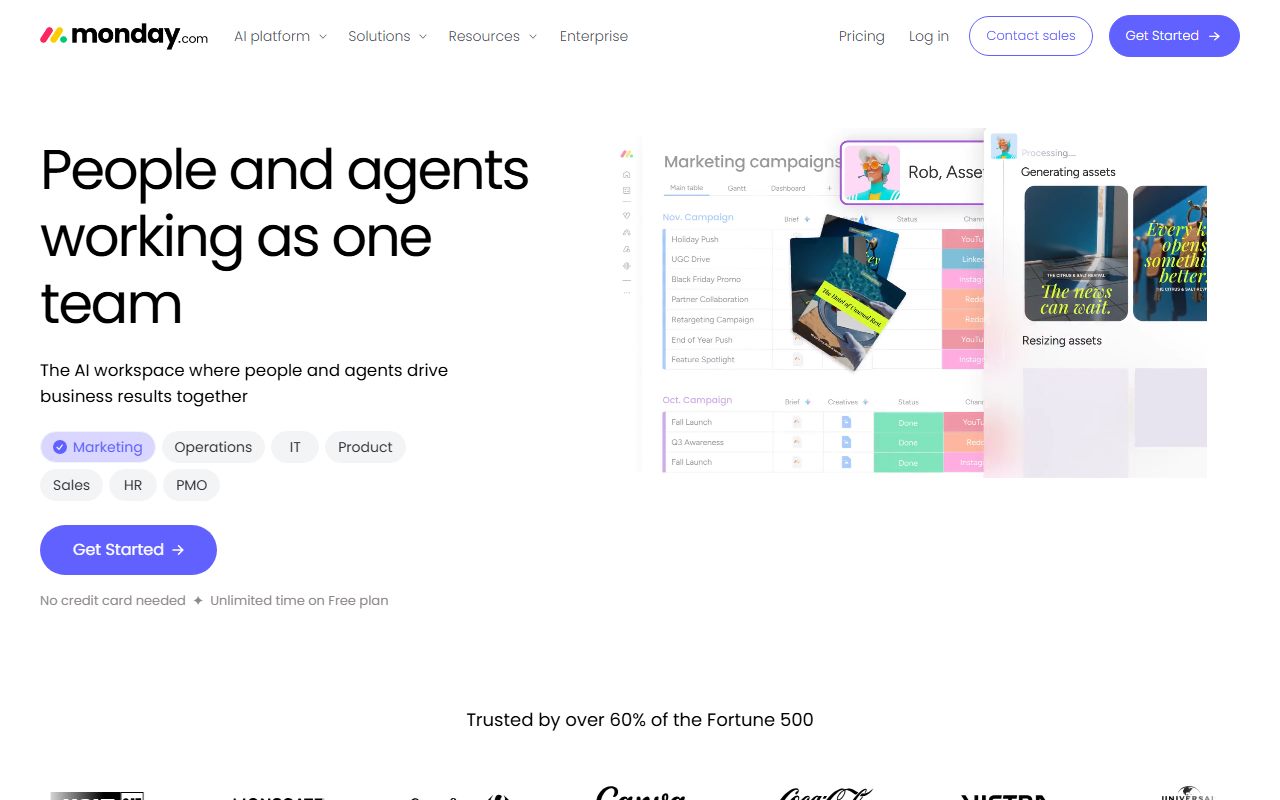
Three kinds of source are admitted. The first is vendor documentation: pricing pages, plan comparison tables, help center articles and developer references, read on a stated date. The monday.com review, for example, prints a 10-seat minimum and a $12 per seat per month Standard rate because the pricing page displayed both on October 7, 2026, and says so. The second is pricing history, which is why several reviews quote the regular rate rather than a promotional one: QuickBooks Online showed a 50 percent discount for the first three months on every paid tier, and the review grades on the regular $85 or $140 figure because that is the rate a business pays in month four.
The third source is verified user reports on public review platforms and forums. These are read for patterns, not for quotes. A single angry review proves nothing; forty reviews over two years that all name the same step from one tier to the next as the painful one is evidence, and the Zendesk review uses that pattern to explain its value score. The site does not reproduce individual reviews, does not count star ratings as its own finding, and marks vendor-displayed ratings as claims rather than data.
Why there is no first-hand testing, and why every review says so
The site does not run paid trials of its own, and does not pretend to. Every verdict ends with a sentence stating that the grade is a documentation review and that no first-hand testing was run or claimed. That sentence is not a legal hedge; it is the single most important fact about the methodology, and a reader deserves to see it before trusting any number.
The reasoning is simple. A one-person trial of a project management tool over two weeks produces an anecdote about one person's two weeks. It cannot tell a reader how the tool behaves for a ten-person team at month nine, which is when the automation quota, the storage cap or the seat minimum actually bites. The pricing page and the plan documentation can tell a reader exactly that, in advance, with numbers. Verified user reports, read in volume, can tell a reader what happens at month nine for hundreds of teams. The combination is more predictive than a staged trial, and it has the further advantage of being checkable: every figure on a review can be traced to a page a reader can open.
There is also a trust reason. Review sites that describe weeks of testing they never did are common, and the habit is hard to detect from the outside. Stating plainly what was and was not done is the only defense available. When a help center refused automated reading, as the ClickUp and monday.com help centers did, the review says so and grades support on what could be read. When a pricing page could not be loaded at all, as happened for Pipedrive and Zendesk, no price is printed and the value score is marked as a structural judgment pending revision.
How to read a single score
A sub-score is a position within a category, not an absolute. ClickUp's ease score of 3.4 does not mean the tool is hard to use in some cosmic sense; it means that among project management tools graded on this site, ClickUp forces more configuration decisions on a new workspace owner than Trello at 4.7 or Basecamp at 4.5, and verified reports name that configuration time as the most common reason for abandonment. Read the sub-score against the "what the score is built from" section of the review, which names the specific documentation and reports behind it.
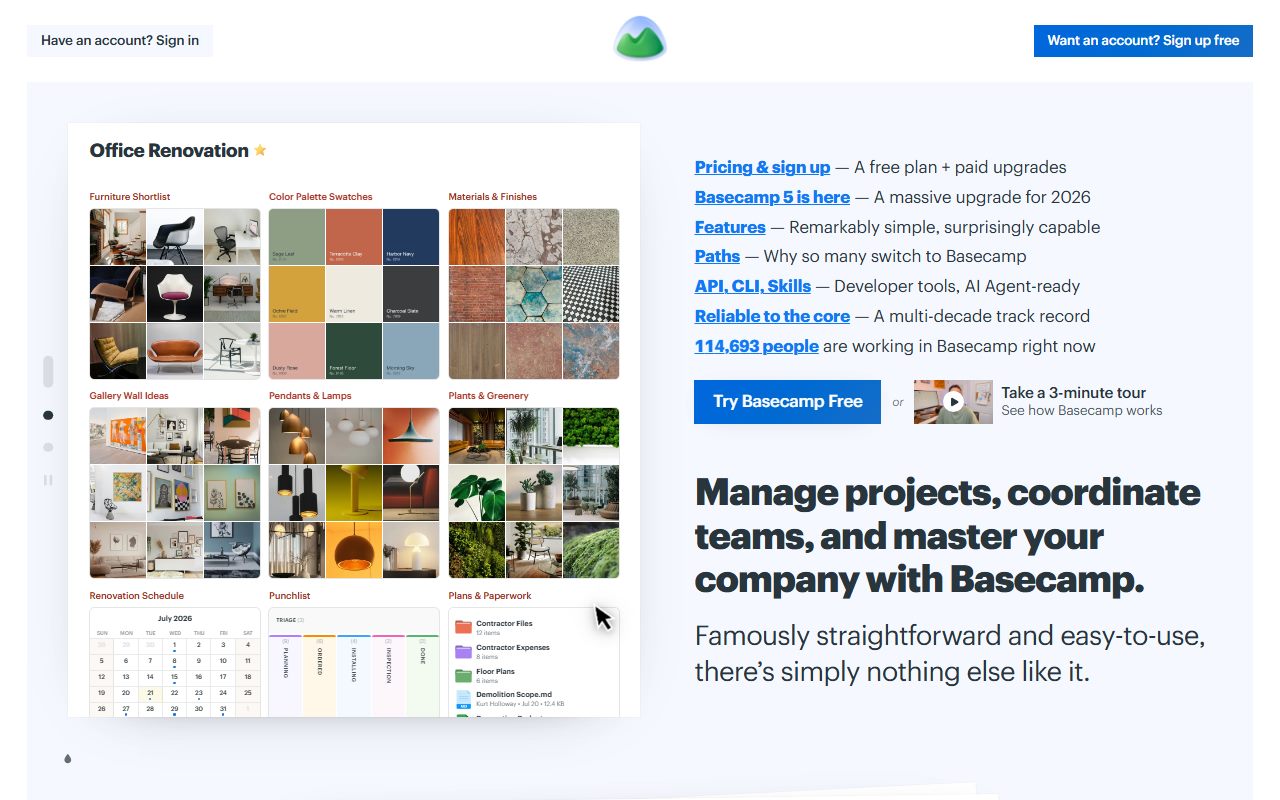
Value scores need the most care because they are calculated at ten seats. Basecamp earns 4.1 on value because its flat $59 per month Studio tier costs $708 per year regardless of headcount, which beats nearly every per-seat competitor at ten people and widens the gap at twenty. The same tool at three people would score lower, and the review says that. Zendesk scores 3.2 on value partly because the features a ten-agent team wants sit above the tier such a team buys; at a hundred agents the review states the score would be higher. The ten-person assumption is printed so a reader at a different size can adjust.
- A score of 4.5 or above: the tool leads its category on that dimension, with documentation to show why.
- 4.0 to 4.4: strong, with a specific and named reservation.
- 3.5 to 3.9: adequate; the review will name the gate or cap that holds it there.
- Below 3.5: a structural weakness for the typical small team, not a bug the vendor will fix next quarter.
What a grade cannot tell you
A grade cannot tell a reader whether their work has the shape the tool assumes. The Asana review spends its first section on the fact that the product assumes one owner per task, and a team whose work has shared ownership will be unhappy at any price and any score. A grade also cannot predict the vendor's next pricing change, which is why every review tells the reader to open the live pricing page before signing and prints the date of the check. And a grade cannot reflect a feature or a limit the vendor does not publish; where a figure is missing, the review says the vendor does not publish it, rather than guessing.
Bottom line
Four equal sub-scores, averaged, built from documentation, pricing structure and verified reports, with the sources and the date printed and the absence of first-hand testing stated on every page. Read the overall number to find the shortlist, read the four sub-scores to see where a tool is strong and weak, and read the "what the score is built from" sections before deciding. If a weight in the rubric seems wrong for a particular business, the four numbers are there to be reweighted. That is the arrangement, and it is the whole arrangement.